728x90
반응형
[CSS] 7. 주축 방향 정렬 Justify-content
1. Justify-content 속성이란?
이는 Flex 컨테이너 내에서 주 축(main axis)을 따라 아이템들을 정렬하는 방향을 정의한다.
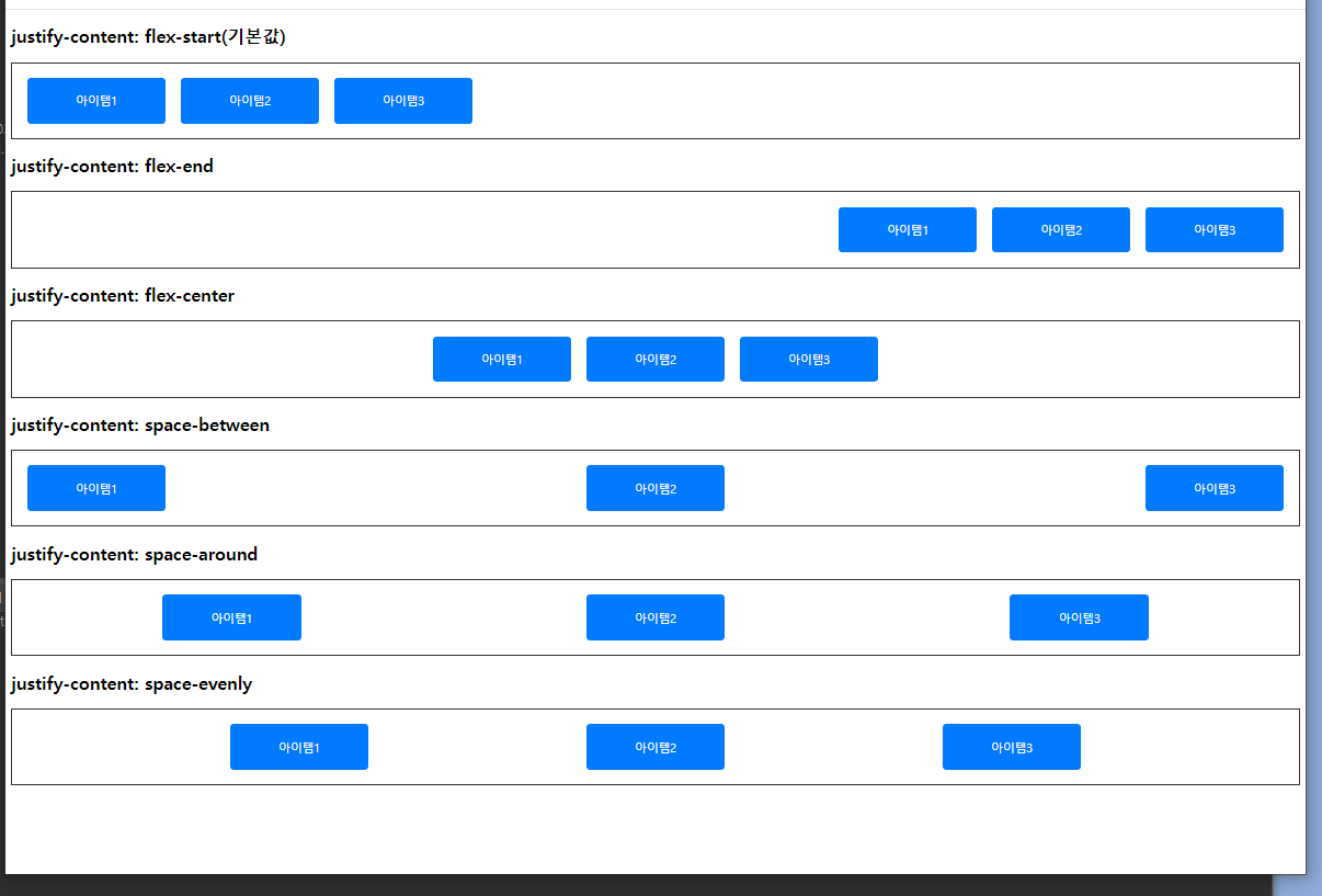
(1) flex-start
(2) flex-end
(3) center
(4) space-between
(5) space-around
(6) space-evenly
2. 시나리오 코드
<!DOCTYPE html>
<html>
<head>
<meta charset="UTF-8">
<title>Insert title here</title>
<style type="text/css">
	.container{
		display:flex;
		border:2px solid #333;
		margin-bottom:20px;
		padding:10px;
		flex-dirextion:row;
	}
	.item{
		background-color:#007bff;
		color:white;
		padding:20px;
		margin:10px;
		text-align:center;
		border-radius:5px;
		width:150px;
	}
</style>
</head>
<body>
	<h2>justify-content: flex-start(기본값)</h2>
	<div class="container" style="justify-content: flex-start;">
		<div class="item">아이템1</div>
		<div class="item">아이템2</div>
		<div class="item">아이템3</div>
	</div>

	<h2>justify-content: flex-end</h2>
	<div class="container" style="justify-content: flex-end;">
		<div class="item">아이템1</div>
		<div class="item">아이템2</div>
		<div class="item">아이템3</div>
	</div>

	<h2>justify-content: flex-center</h2>
	<div class="container" style="justify-content: center;">
		<div class="item">아이템1</div>
		<div class="item">아이템2</div>
		<div class="item">아이템3</div>
	</div>

	<h2>justify-content: space-between</h2>
	<div class="container" style="justify-content: space-between;">
		<div class="item">아이템1</div>
		<div class="item">아이템2</div>
		<div class="item">아이템3</div>
	</div>

	<h2>justify-content: space-around</h2>
	<div class="container" style="justify-content: space-around;">
		<div class="item">아이템1</div>
		<div class="item">아이템2</div>
		<div class="item">아이템3</div>
	</div>

	<h2>justify-content: space-evenly</h2>
	<div class="container" style="justify-content: space-evenly;">
		<div class="item">아이템1</div>
		<div class="item">아이템2</div>
		<div class="item">아이템3</div>
	</div>
</body>
</html>
728x90
반응형
'HTML,CSS > CSS' 카테고리의 다른 글
| [CSS] 시험 (0) | 2024.07.02 |
|---|---|
| [CSS] 8. 교차축 정렬 (0) | 2024.07.02 |
| [CSS] 6. flex-wrap (0) | 2024.07.02 |
| [CSS] 5. Flex-direction 속성 (0) | 2024.07.01 |
| [CSS] 4. Flexbox (0) | 2024.07.01 |


